
Colors
Framer
Branding
Web design
Web dev
UX/UI
Motion
Colors
Framer
Branding
Web design
Web dev
UX/UI
Motion
Sarah approached us to help her build a raw, bold & inclusive brand for her social media management agency.
It was important for her to stay away from the corporate brand bubble that agencies in Montreal often fall in. Colors’s focal point is authenticity, helping it’s clients to express their true selves online, flaws and all.

The whole foundation of Colors is about helping people show up online as their true selves—flaws, quirks, chaos and all.
That energy had to come through in every single element we designed.
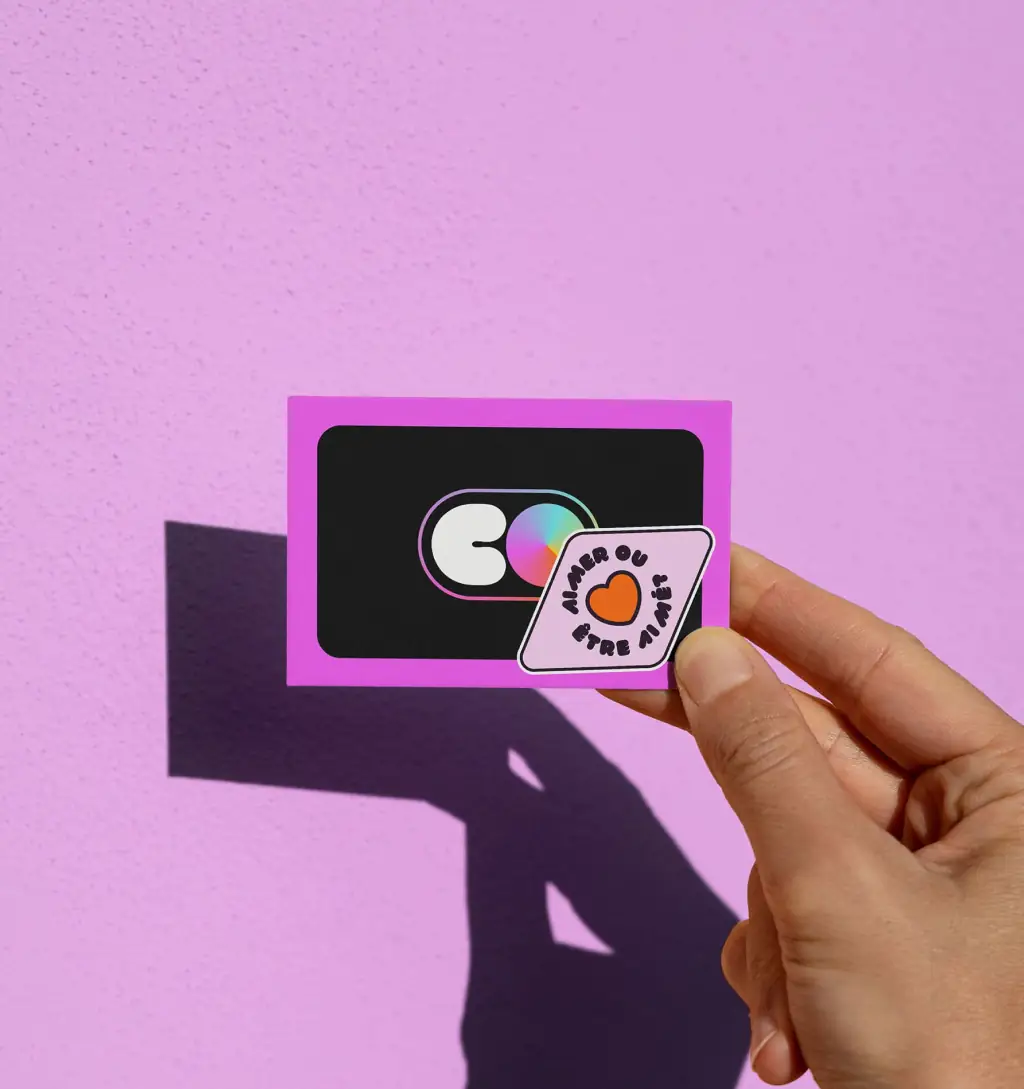
At the heart of Colors, we created a central icon that would be reused across all 3 logo marks.
The icon is made of a gradient hue that reminds the audience of the vast spectrum of brand values: diversity, inclusivity, equity & creativity.
The whole foundation of Colors is about helping people show up online as their true selves—flaws, quirks, chaos and all.
That energy had to come through in every single element we designed.
At the heart of Colors, we created a central icon that would be reused across all 3 logo marks.
The icon is made of a gradient hue that reminds the audience of the vast spectrum of brand values: diversity, inclusivity, equity & creativity.

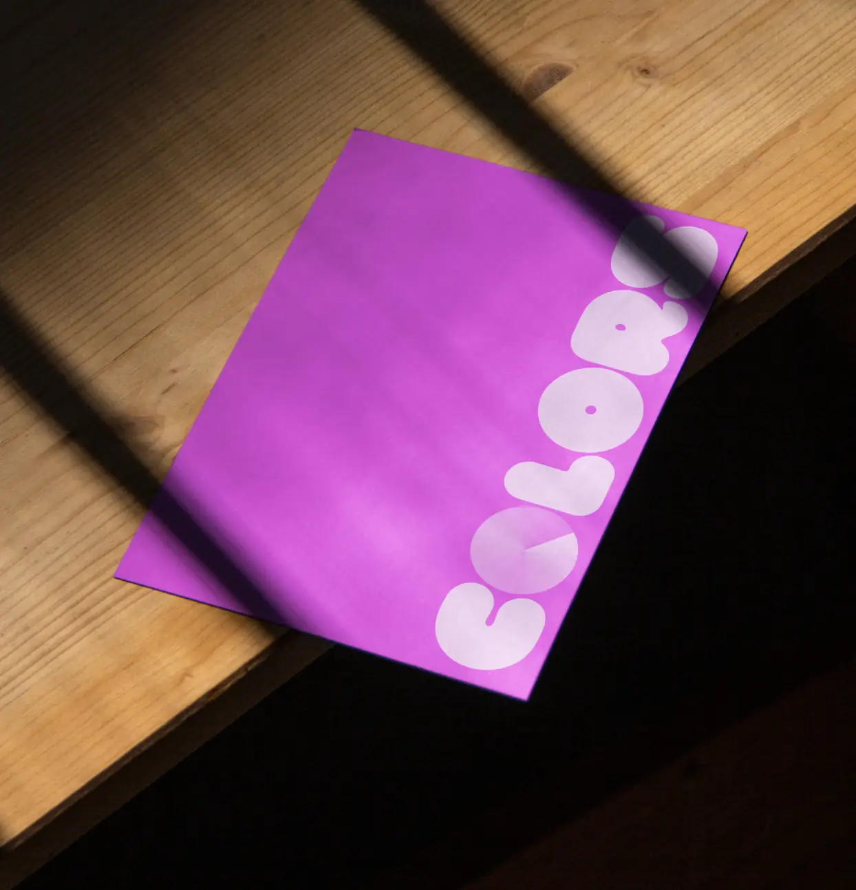
Once the logo was created, we had to go further into the identity, so we got to work on the brand book.
This thing had to feel like Colors: bold, human, and unapologetically real.
we designed every page to reflect the energy of the brand: big type, a bold color palette, sticker-style elements, and playful copy that reads more like a conversation than a guideline.

Since Colors lives and breathes on socials, it was critical that the website reflected the brand's personality.
Think of it like a digital space for potential customers to feel like they can be themselves online.
I carefully crafted the website from the brand’s assets, typography and color palette.
Since Colors lives and breathes on socials, it was critical that the website reflected the brand's personality.
Think of it like a digital space for potential customers to feel like they can be themselves online.
I carefully crafted the website from the brand’s assets, typography and color palette.
Since Colors lives and breathes on socials, it was critical that the website reflected the brand's personality.
Think of it like a digital space for potential customers to feel like they can be themselves online.
I carefully crafted the website from the brand’s assets, typography and color palette.

we kept the structure simple but impactful, designed to move fast, feel fun, and immediately let visitors know what the brand stands for.
The messaging is cheeky, bold, and straight to the point. You’ll find hand-drawn lines, a colorful UI, punchy headlines, and just enough motion to keep it playful.


our biggest challenge was keeping an industry standard look while also breaking the mold and being unique & bold.
This was the real tension point in the project, how do we push creative boundaries without sacrificing professionalism?
we knew the brand had to look legit, especially since it’s targeting businesses who are serious about growth on social. But it also couldn’t be boring. That’s where we leaned into contrast. Clean layout meets hand-drawn lines & high-contrast colors. Strategic messaging meets playful language. It’s this constant push and pull that makes the brand feel alive.
Colors isn’t just a brand, it’s a statement & it sends a strong message: Be yourself! This project reminded us how powerful it is when a brand lets go of trying to be safe for the sake of personality.
What if more brands dared to be real? Wouldn't the internet feel a little more alive?
Colors isn’t just a brand, it’s a statement & it sends a strong message: Be yourself! This project reminded us how powerful it is when a brand lets go of trying to be safe for the sake of personality.
What if more brands dared to be real? Wouldn't the internet feel a little more alive?
Colors isn’t just a brand, it’s a statement & it sends a strong message: Be yourself! This project reminded us how powerful it is when a brand lets go of trying to be safe for the sake of personality.
What if more brands dared to be real? Wouldn't the internet feel a little more alive?
I called on Karim when I needed a new website and visual identity for my agency, COLORS. Karim really knew how to bring my ideas to life, and I'm extremely proud of my branding. In 2 months, he was able to create my branding, develop my website, and our collaboration went really well. Karim was a pleasure to work with and I'd definitely use his services again for other projects.
5/5
Sarah Oirdighi
Founder @COLORS


or get in touch:
or get in touch:

All rights reserved © 2025 Kad Studio
made with ❤️ in montréal