
Signalzer0
Framer
Branding
Web design
Web dev
UX/UI
Motion
Signalzer0
Framer
Branding
Web design
Web dev
UX/UI
Motion
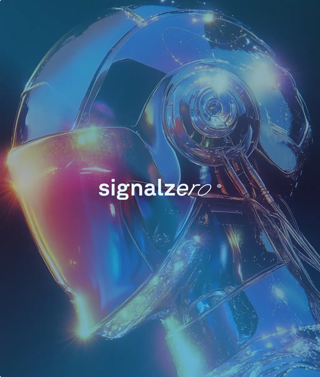
When Signalzer0 first landed in our inbox, it didn’t feel like just another project. It felt like stepping into the future.
A robotics company with real-world ambition, not just flashy buzzwords. They weren’t trying to be the next big thing, they were already building it.
What they needed was a brand and digital presence that looked like it came from 2035, but still felt human today.
we started with the logo. The name Signalzer0 already had this beautifully cryptic, sci-fi energy to it. So we leaned into that.
The logotype uses the unique feature of the font 'GT Planar', multiple levels of italics and weight. This allowed us to create a logo that goes further in italics letter by letter. The final logo mark blends a 'S' and a filled 0, creating an empty space between them.

The website needed to move and feel like an exploration into the future.
Utilizing consistent circle, square and diamond gradients with electric colors, we created motion that feels like you are scrolling through a story.
Like a digital experience that's slowly unraveling a new world beneath your eyes.

Signalzer0's brand and website really complete each other.
New generations, which are the consumers of the future, are tired of boring corporate companies with 'safe' brands.
In the digital era, consumers want to see bright colors, bold iconography & a imaginative tone of voice. They want to feel something.
This is why we opted for a super unique & out-of-this-world brand identity, which then translated into all sorts of powerful visuals to be integrated on socials, the website, prints and other mediums.
Final thoughts
What if a website didn’t just show you something, but made you feel something? Wouldn't that spark the urge to dive in, connect, and become part of the world the brand is creating?
Final thoughts
What if a website didn’t just show you something, but made you feel something? Wouldn't that spark the urge to dive in, connect, and become part of the world the brand is creating?
Final thoughts
What if a website didn’t just show you something, but made you feel something? Wouldn't that spark the urge to dive in, connect, and become part of the world the brand is creating?


or get in touch:
or get in touch:

All rights reserved © 2025 Kad Studio
made with ❤️ in montréal